min read
Email Marketing Tips Your Members Will Love
Smart email marketing and design keep readers hooked on what your association has to offer. These tips can help boost your emails to new levels and increase your overall open and click rates.

%201.avif)
Smart email marketing and design keep readers hooked on what your association has to offer. These tips can help boost your emails to new levels and increase your overall open and click rates.

Email marketing is a powerful tool used by associations to keep members up-to-date and engaged. But, are your association’s email marketing efforts truly engaging members? Or are your emails going to waste?
We’re bringing you a blog series on email marketing. It will provide a comprehensive guide on how your association can succeed with email marketing and heighten your members’ engagement
.Let’s start with email design. Does your association have an appealing design for its email campaigns? If not, it could be detrimental to your open and click rates.
As consumers, we receive countless emails everyday. Some catch our attention while others pass by and get deleted. A well-thought out and easy to read email design can help ensure your email does not get passed over.
Email design is crucial for presenting members an interesting and informative email while delivering your association’s message. Your design is what brings your content to life in an email.
Content is easily consumed by readers if presented through an email design like an HTML design template code or an infographic. Design templates take the guessing games out of email marketing, instead guiding readers to the important sections of content in your emails .So, how can your association create an incredible email design that will engage readers?
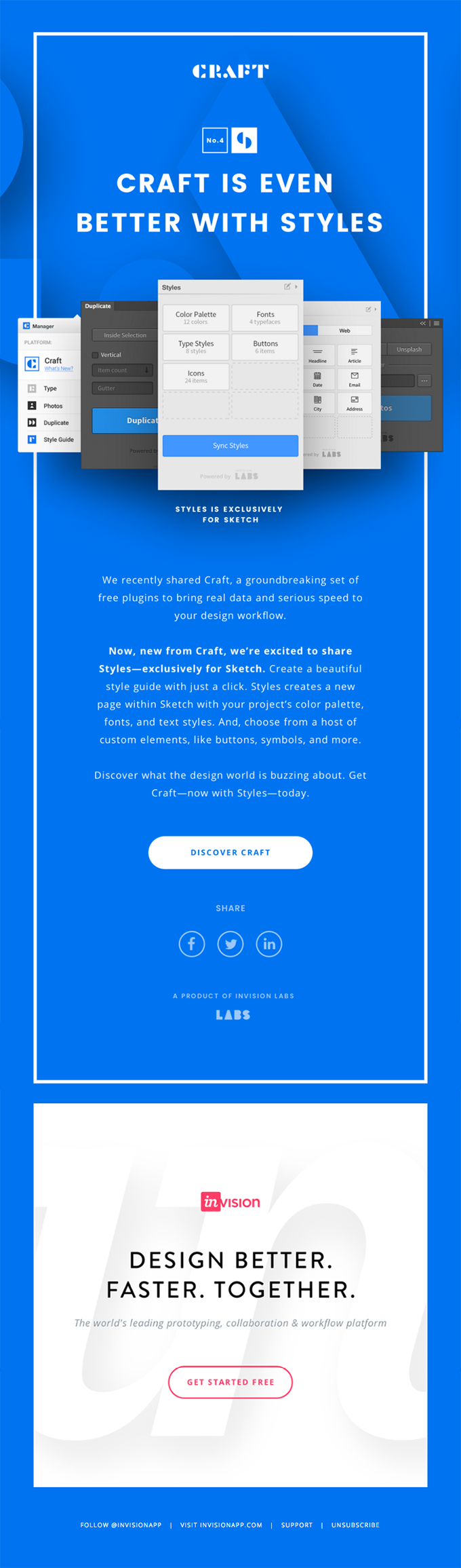
While email design templates are a great way to catch attention, sometimes too much design is confusing to readers. Make sure your design compliments your email content. If your email design smothers the content inside, readers may be deterred from reading emails in the future. The idea of email marketing is to get your association’s goals across as quick as possible. Stick to 2-4 colors for your design palette and use a consistent font. Don’t make readers struggle to find the key points of the email. Make sure your email’s message is framed within the design so that the design does not swallow the content being offered. InVision does a great job of sticking to a simple, effective email design template. As seen in this email design, InVision uses a minimalistic design and sticks to using as few colors as possible. The blue background allows the white text to pop out, and the content can be easily viewed right in the center of the design. The design template isn’t overly fancy, however it gets the job done and the message across clearly.
Your association’s website is a perfect place to look when brainstorming email design templates. Most likely, your website sticks to a specific color template and font. Why not incorporate that template into your email design?
By sticking to the same design as your website, you create a consistent brand for your association’s members. Email receivers will notice the uniformed design of both your emails and your website, and that design should stick in their heads.
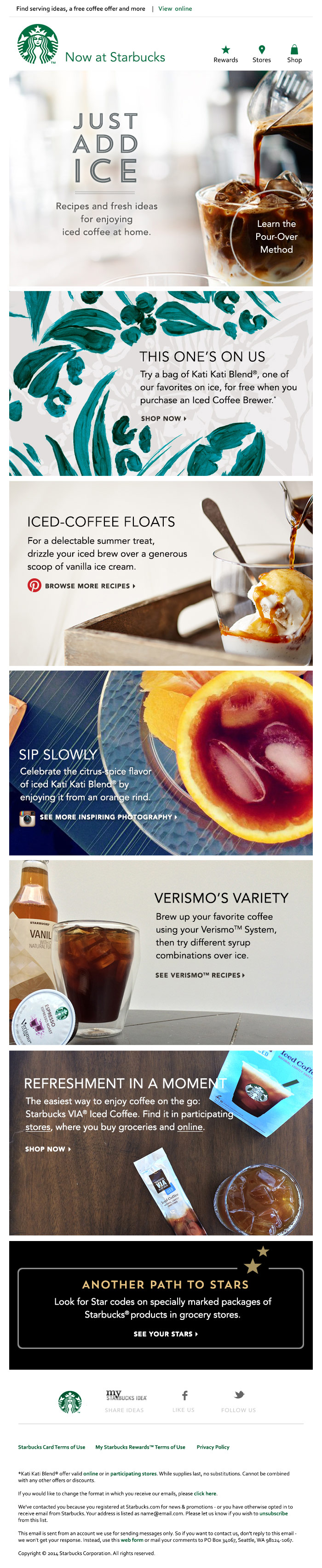
Many coffee drinkers can pinpoint the Starbucks brand by the very specific green they use in all of their logos. The same can be said for Starbucks and their email campaigns. Starbucks incorporates that green logo color into their email marketing as their default color for hyperlinks. While the use of green is subtle, it helps tie the email together and keep the campaign uniform to the Starbucks brand.
Your association can use this strategy as well. Use your website and brand colors in your email design template. If you have a specific font your association uses, keep it consistent. Small design strategies like this can create huge results with email recipients. If your association does not have a specific color or font scheme, this next tip is for you.
Research in color psychology shows that certain colors stand out more than others when looking at an image. An image that contains bright red typically leaves a larger impression than an image using beige.
Know what colors work for your association’s message. An email design using reds and yellows conveys a bright, energetic template for your content. On the other hand, using cool tones in your template creates a calm, relaxing space for readers.
The same idea applies to fonts. Using a font that capitalizes letters is a strategy to make text pop out. A capitalized font could be used for titles, headers, and call-to-actions (CTAs).The Collaborative Fund did its research when choosing colors and fonts for their email campaign- and their efforts were successful. In this email campaign designed by the Collaborative Fund, you can see the bright pops of yellow and red that demand attention from consumers. They also used a capitalized font to help convey their message of frustration and high energy that the campaign calls for.
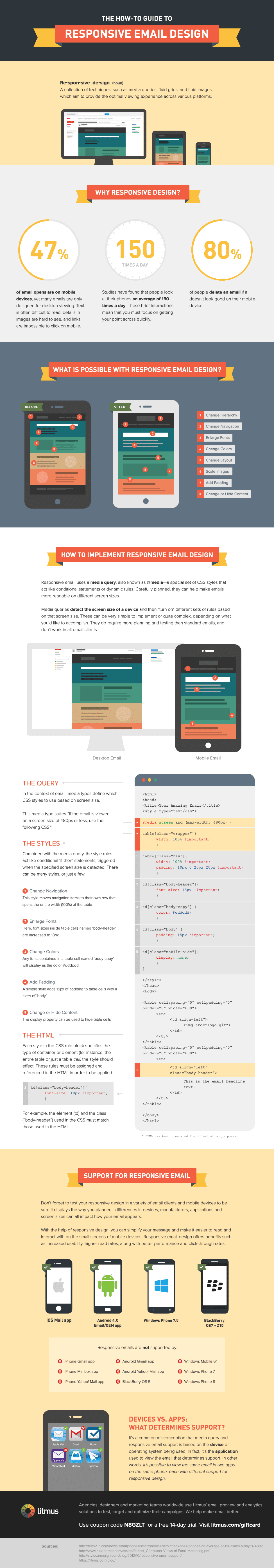
These days consumers are constantly on the move. Many consumers use mobile devices to check emails no matter where they are or what they’re doing. In fact, 44.7% of email opens occur on a mobile device, which is more than tablet or desktop opens.
Are your emails mobile-friendly? Do they cause confusion when viewed from a mobile device? Make sure your email designs are viewable from all devices. To avoid confusion, design your emails for mobile devices first. According to SmartInsights, 80% of email recipients will delete an email if it doesn’t read well on a mobile device. Mobile designs call for specific design templates. Take mobile images as an example. For most images to be mobile-friendly, they have to be within 600 pixels wide. Multiple column designs also cause confusion when viewed on a mobile device. Use a single column email design to keep mobile-users happy while also engaged. Avoid using images to present your CTA. Images can get lost in translation for mobile-users, therefore losing your association’s message as well.
Presenting CTAs in text form ensures that your entire audience receives the information contained in your email. Apple creates an email design for mobile-friendly users, which is important to a company that produces mobile devices. They use a single column design with minimal images. They also provide important content and links outside of an image. Their email designs are viewable on both desktop and mobile-users alike.
Copyblogger provides plenty of tips for creating a mobile-friendly email design that make mobile design easy and understandable.
Your audience needs a reason to check out your association’s web content and offers. However, Providing too much content can work against you in the long run.
Don’t give away all of your content in your email. Design your emails to give members a small taste of what to expect from your association’s website. Members will be hooked from what they read in your email and will want to know more.
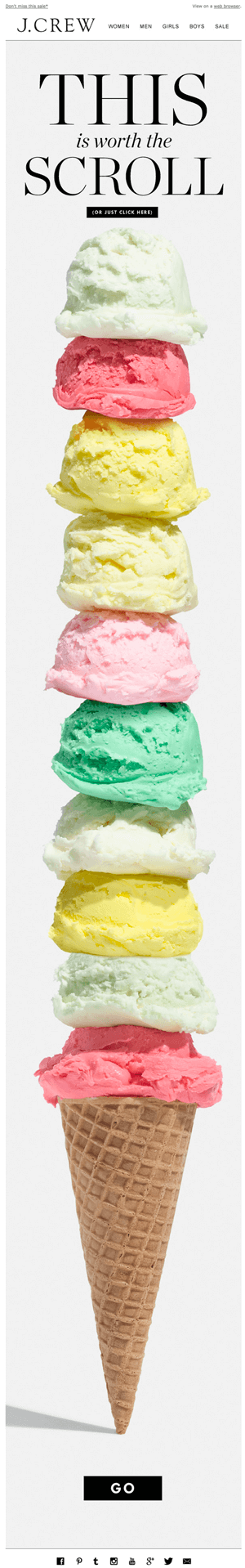
Crew presents a sale to its customers in an email campaign that leaves a lot to the imagination. The campaign is colorful and exciting, but doesn't give away details of the sale. Readers are prompted to go to the website for more information on the sale.
Add an element of mystery to your email design. Provide links to more content for readers and encourage them to explore your website for answers. Leave cliff hangers in your content that leave readers wanting more information.
Smart email marketing and design keep readers hooked on what your association has to offer. These tips can help boost your emails to new levels and increase your overall open and click rates.


